|
Rob
O'Connor was part of the 'in house' design team at Polydor. He first worked on the cover for 'Join Hands'.
In 1981 he set up his own design company 'Stylorouge'. He continued to work with
Siouxsie & The Banshees and was responsible for the record sleeves for;
Happy House, Christine, Kaleidoscope, Israel, Spellbound, Arabian Knights, Juju,
and The Creatures' Wild Things, Miss The Girl and Feast. Stylorouge are now an
international and well respected design company. They have been responsible for
record sleeves for artists as diverse as Blur, Geri Halliwell, George Michael
and also have been successful in many other fields including film and web
design.
Were you part of the 'in house' design team at Polydor when
the
Banshees were signed?
No, I joined in January 1979.
You didn't work on their first few releases, were/are you a
fan of
their music and what were your thoughts on the album sleeve for
their
debut 'The Scream'?
Yes, I enjoyed their confrontational no-nonsense attitude to
the major
record company pomposity of Polydor right from the start. I was
brand
new at the company and had been involved in the so-called new-wave
scene down in Brighton previously. This was just the start at
Polydor I
was keen to be involved with. I still had to work for the likes of
James Last and later on the retro mod bands and new romantics
however. I thought The Scream had a great cover. Dark, evocative, not
predictable, not literal, quite slick in fact. I was a fan of Jill
Mumford's work. It was Jill who I replaced at Polydor.
'Join Hands' was the first Banshees album sleeve you were
involved
with. We know that the cover for 'Join Hands' was
pretty much a last
minute decision when copyright for a previous piece of artwork of
two
children holding hands became an issue. Were you involved
with the
initial drafts of the album sleeve, and do you remember the first
choice of picture?
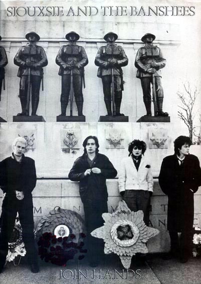
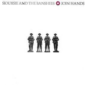
Yes vaguely. I believe it was done in part by John Maybury who
went on
to be more of a film-maker. The Join Hands sleeve that eventually
made
it to the shops
featured four of the soldier statues cut-out from
a
press shot of the band , I believe
taken by Adrian Boot for the
NME or some other paper. The real battle for us was
to convince the
company to
use textured board and make it a gatefold. The lack of colours
helped
to win
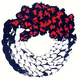
the day. The wreath of poppies was devised to help add colour
and create a graphic device for use on merchandising. I've seen
the odd T shirt with the soldiers on even recently. I've always liked the
illustration of the band on the inner spread - it was the only part of
the original design that survived.
 Within the constraints of the Polydor 'in house'
design team were
you given much of a free reign. Was there a sense of
loyalty to the
company, to a particular band, both, or just to follow your own
vision?
Polydor was an unhealthily overweight, generally out-of-step
company at
the time - I was a newcomer and a fairly insignificant cog in the
machine, but an ally to the bands I worked for. There were some
bands
who seemed to exercise much of their communication with Polydor mainly
through the art department. My aim was always to pursue as
iconoclastic
a visual path as possible, wherever possible, after all, this was
fashionable at the time
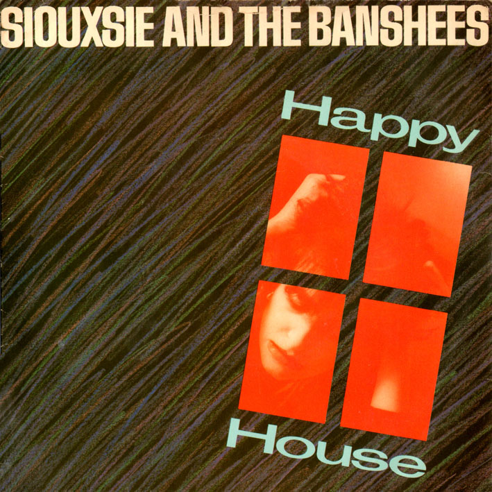
'Happy House' was the first Banshees picture sleeve
to feature
Siouxsie on the cover. As the band was always adamant
that they were
a four piece and not just a backing band for Siouxsie was the
cover
something you pushed for or was it never an issue?
It was one of a handful of ideas that I put forward. The solo shot
of Siouxsie had a deranged look about it and seemed to suit the
feeling of
incarceration. I don't remember the other members of the band
having a
problem with the cover. The only single format was 7" vinyl
and a group
shot wouldn't have had the same impact. Usually we would avoid having
any shot of the band anyway... this one slipped through.
The covers for Join Hands and Happy House were
simple and
definitely conveyed a sense of what the buyer was going to
find on the
record. They were also definitely from the 'less is more' school of
thought. Did you find any resistance to the artwork presented
for
these releases? What inspired such minimal covers?
To some extent I was still cutting my design teeth at the time,
and
getting used to what was possible. I hadn't yet come to appreciate
the
potential that collaboration offers, so the early designs
reflected a
combination of the Banshees and my own taste and the limitations
of my
own artistic abilities. One of the objectives was to avoid the
sleeves
looking like so many other 'post-punk' sleeves of the time.
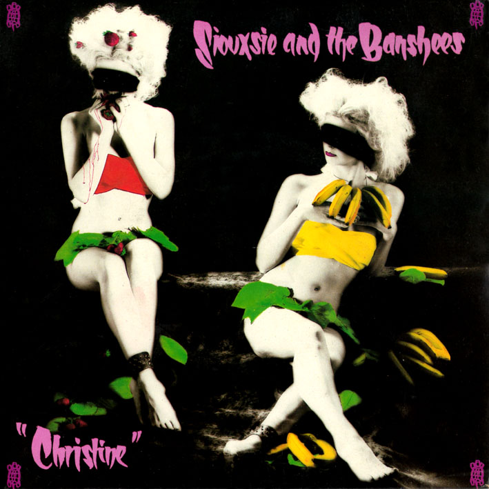
'Christine' is one of my all time favourite record
sleeves and probably the first time I became aware of Rob O' Connor. Who
were the
models used in the photo shoot?
It's a simple 'trick' photograph really, shot and assembled in an
early 20th century European kind of way. It's a single girl, cast from a
model agency, shot in two positions and composited in the darkroom
(no
computers
then). The look of the sleeve conveyed the band's
interest in
German film
and photography. The hand painted type and purple
turtles
hopefully added a sense of personality and naivety
The 'Israel' cover is unique in the respect that the
reliance is more on the record label than the sleeve, whose inspiration
was that?
I think this was my idea, although I won't sue if someone
contradicts
me. The sound of the track seemed very grand - the theme of the
song
itself was certainly not traditional pop song material. It felt
like it
needed some
thing outside the norm. The painting of the chrome Star
of
David was adapted from an old album of traditional Jewish songs.

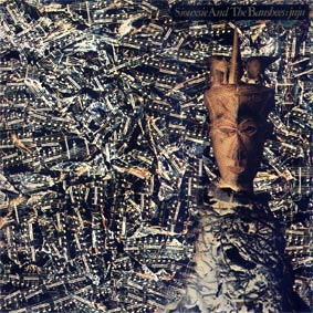
As an introduction to your book 'Stylorouge' you
mention an early
advertisement for 'punk' group 'The Adverts' consisting of a
series of
guitar chords. Was this still in your mind when you
worked on the
'Juju' album sleeve? I've read that the mask featured
on the sleeve
was a contribution from the band themselves. Was
working with the
band generally a collaboration, how much input did they have
themselves?
The band's input was often essential. Only by understanding the
way a
band see themselves can really effective artwork be produced. For juju,
The band suggested using the African figure - a fetish - and I
commissioned the photo illustrator Thomi Wroblewski to research
and
photograph possibilities at the
Museum of Mankind. They had also
asked me to try and give the final
image a Dada kind of approach, and the eventual combination with
crumpled and hand-coloured sheet music
achieved that I think. Thomi
had a bunch of prints of the fetish,
some
of which had been printed using the transparencies as negatives, which
turned the almost black wood of the object to look more like gold.
The
convergence of all the influences involved was helping to create
something almost unforeseen - very exciting.
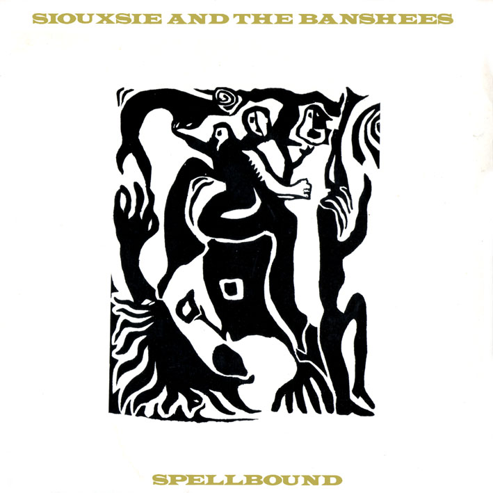
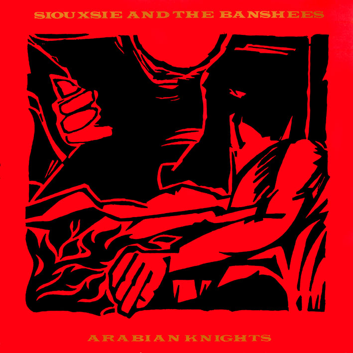
As a young fan I remember being impressed that the
sleeves for
'Spellbound' and 'Arabian Knights' (two singles from the same
album)
were thematically similar. Was there any
thought/suggestion that the
album sleeve should also be along the same lines i.e. a
woodcut?
Not really. The woodcut idea was a natural development of the
primitive
art theme. The band had found a woodcut by an artist - I believe
called
Gerhard Richter. I contacted his widow at the time - never shy to
take
the direct route - and she politely declined the use of
the work. A
husband and wife team of woodcut
artists, Lars and Lois Hokansen,
were
then commissioned to produce an image with a similar feel - a
crazed
ritualistic dance scene. I drew the image for Arabian Knights
myself, to
some extent to save money.
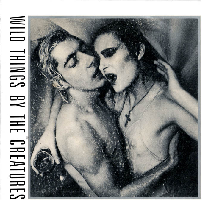
The Wild Things EP musically is very
claustrophobic, laid bare,
and stripped of any over embellishment, something I think the
artwork
for the sleeve captures perfectly. Siouxsie has since
said that her
inspirations for the infamous sleeve were the shower scene in
'Psycho'
and Millias' painting 'Ophelia'. Were you aware of this
at the time?
She may have overlooked the photographs that a couple of gay fans
from
the USA had sent to her of themselves in a shower. Either that or
the
band may have made this story up to get me going! I don't remember
the
"Psycho' reference although I guess it's an obvious one in
retrospect. What I loved about the images was that the subject matter
dealt with
raw spontaneous desire and the shoot was carried out in an appropriately
last minute fashion. It really captured the
stripped-back sensuality of the EP. I still find the Creatures projects very
exciting
musically.
You worked with numerous different photographers
during and since
your work with the Banshees but a name that keeps popping up
is Adrian
Boot. Do you have a particular favourite?
To work with great photographers has been one of the most
fulfilling
aspects of my work. I don't have a favourite as such, but I've had
the
pleasure of working with Simon Fowler, Kevin Westenberg, Sheila
Rock, David Scheinmann, Michele Turriani... loads of great people
Photography plays an important part in some of the
design elements of your work. Do you have a preferred medium
to work with/in?
Each job will suggest the best way to go. I love photography,
illustration and typography. My current obsession is carrying a
project
over a range of media. Stylorouge has embraced new media - we've
got
pretty good at it actually! A perfect project is: album and single
packaging, print and on-line marketing, promo video, website...
I've
even got into taking my own photographs more often. Directing
videos
and EPK's has become as important to us as design over the past couple
of years.
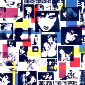
Out of all the covers which one was the hardest to
sell to the band and did they ever reject
any outright?
Without doubt, Once Upon A Time was a masterpiece of bad
communication. The band were on tour in Europe, and without the benefit of modern
digital communications we had to rely on post and couriers to
present
visual ideas. The band had resisted the idea of a Greatest Hits
package
at all, so we were on a sticky wicket to start with. I'd sketched
out
an idea involving a moody, spooky photograph of a rag doll of
Siouxsie
in a Victorian
cot. At that point the album had no title (The Best
Of
wasn't an option) so I'd visualised some old fashioned
calligraphic
type with my own suggested title 'Playthings'. Their manager at
the
time, Nils Stevenson, took the visual with him
to show the band in
Yugoslavia, but failed to show them my accompanying note.
The idea was
rejected out of hand. Later I was to read an interview with Sioux
and
Severin where they criticized the idea as being a cartoon.
Fortunately
for me this was part of a verbal annihilation of the record
company,
not me, but clearly they had not understood or been explained the
concept. The relationship of image and title and its reference to
the
music business was pertinently ironic.
 Do you have a particular fondness or overriding
memory of any
sleeve design in particular?
Probably Wild Things by The Creatures. It felt very different for
the
time and the memory of being perched on the toilet seat of a Newcastle
hotel bathroom spraying Siouxsie and Budgie will amuse me for
ever.
The last piece you worked on with Siouxsie was The
Creatures'
'Feast' album. In your book 'Delicious' you state that
when you
started your career with Polydor you toyed with the idea of
being star
struck for a while, but that soon passed. You describe
Siouxsie as
being' no different than the people you went to school or
collage with'. When your working relationship with the band
ceased did you
follow their progress. Were you aware of any of their
subsequent
record sleeve designs?
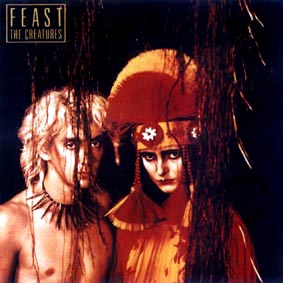
Of course. I remain a fan and have enjoyed monitoring their visual
history.
When designing an album or CD cover, where do you
pull most of
your inspiration from? Do the artists themselves give
you ideas to
work from, or do you have total artistic license? How much does the
actual music inspire you to make creative images and/or
designs? When
I listen to music, I get a lot of creative ideas. I think
music has a
strong link to visual art.
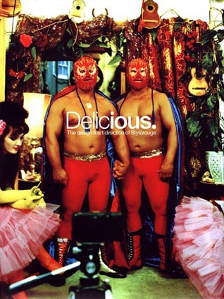
Oh boy. This is a long answer, although the alternative is a great
chance to plug the book Delicious where this kind of stuff is
discussed
- it's readily available on
Amazon
Your dream job. Who would you really like to
work with?
Tom Waits? The love child of Courtney Love and James Brown?
Greenpeace?
The music industry still occupies a large
percentage of 'Stylorouge's' workload. With the advent of smaller and
smaller recording formats and even medium that requires no packaging
e.g. MP3, where do you feel this leaves design in general?
Question 12 has the answer.
Artistically how would you represent Siouxsie in
the year 2004?
Brilliantly well.

Questions From: Petah, Spellbound, Venus Sands, Robbiefett,
Queitkaos, Pico, Betty Jet Blake, The Skull, Exterminating Angel
|